
Ihre Anfrage wurde erfolgreich gesendet.
Ihre E-Mail wurde erfolgreich gesendet.
Ihre Favoriten wurden erfolgreich gesendet.
CHACO 2024

27 1/2 x 19 5/8 inch

6 7/8 x 9 1/2 inch

11 5/8 x 8 7/8 inch

9 x 7 1/2 inch

8 5/8 x 7 1/8 inch

9 x 7 7/8 inch

7 7/8 x 11 3/4 inch
7 7/8 x 5 7/8 inch
7 1/8 x 5 1/2 inch
13 x 5 3/8 x 2 3/4 inch
16 1/2 x 5 3/4 x 2 1/4 inch

16 1/8 x 6 1/2 x 1 3/4 inch
14 x 10 x 1 3/4 inch
5 3/4 x 4 1/8 x 1 1/4 inch
5 3/4 x 4 1/8 x 1 1/4 inch
16 3/8 x 13 inch
16 3/8 x 13 inch
13 1/4 x 10 7/8 inch
13 1/4 x 10 7/8 inch
13 1/4 x 10 7/8 inch
18 7/8 x 13 inch
15 x 9 7/8 inch
15 3/4 x 11 3/4 inch
15 3/4 x 11 3/4 inch
11 3/4 x 8 1/4 inch
11 3/4 x 8 1/4 inch
CARSTEN FOCK
* 1968 in Deutschland
lives and works in Vejby, DK and Bamberg, DE
1995 – 1997 Academy of Fine Arts, Kassel
1997 – 2002 Städelschule Frankfurt M., Master scholar Per Kirkeby
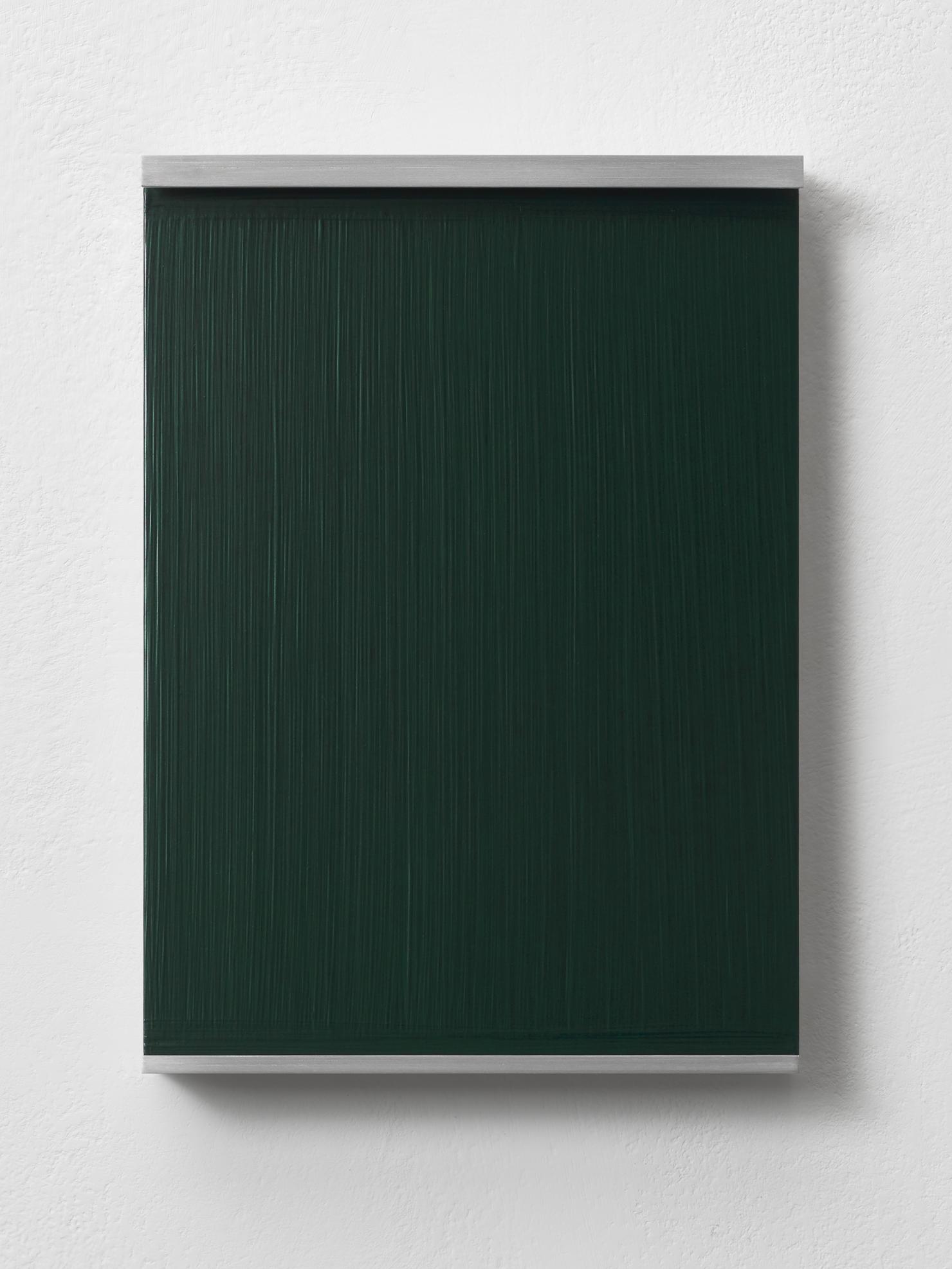
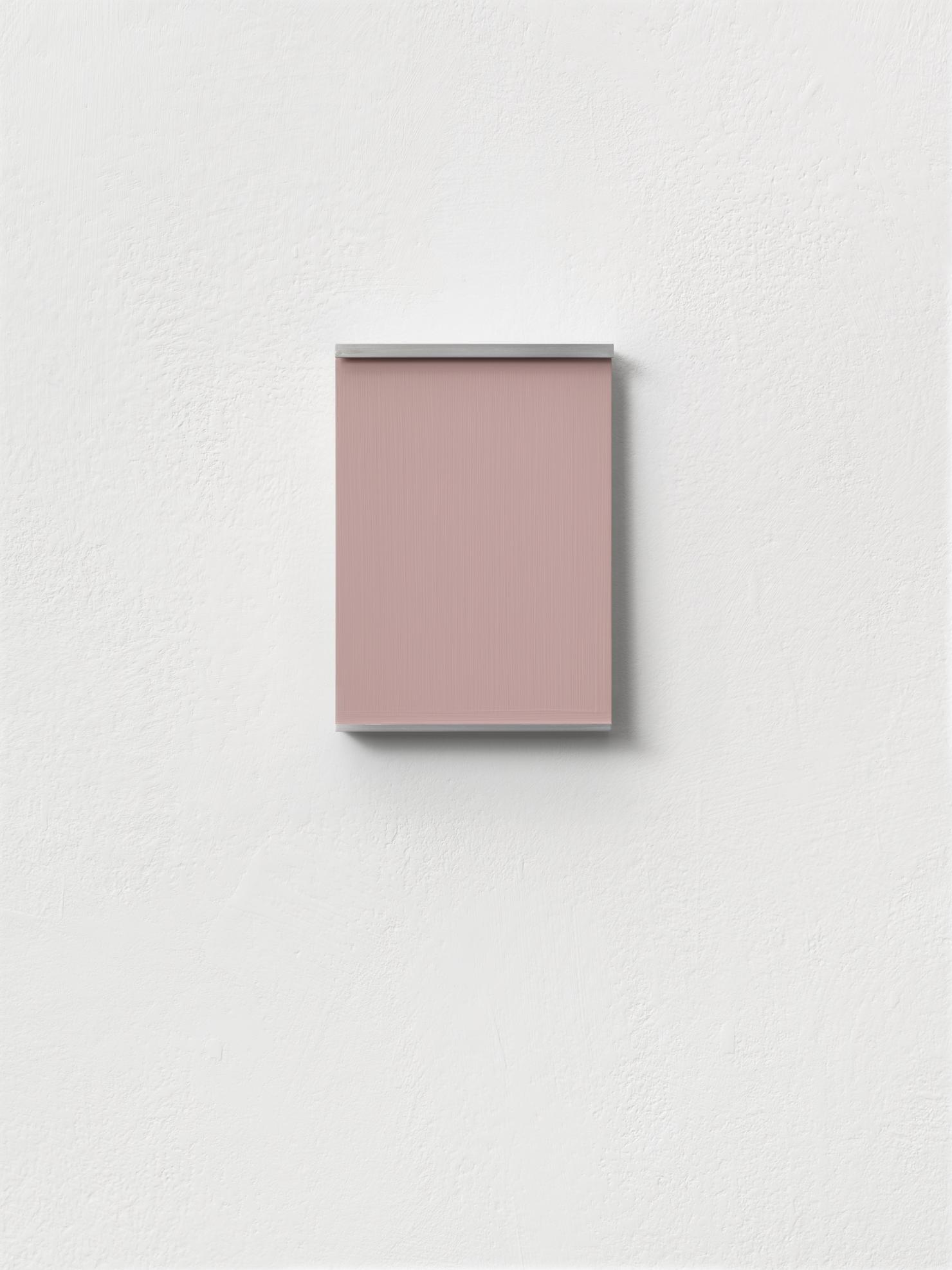
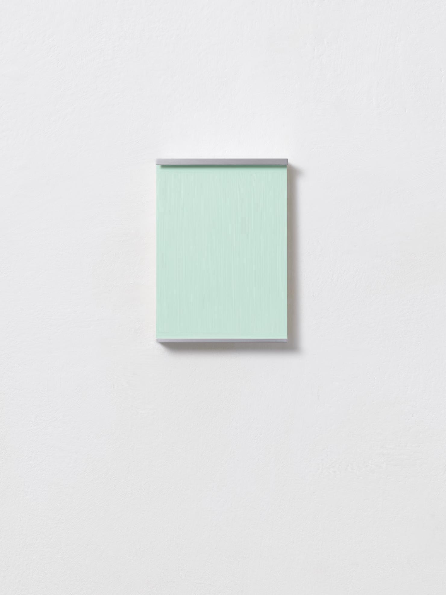
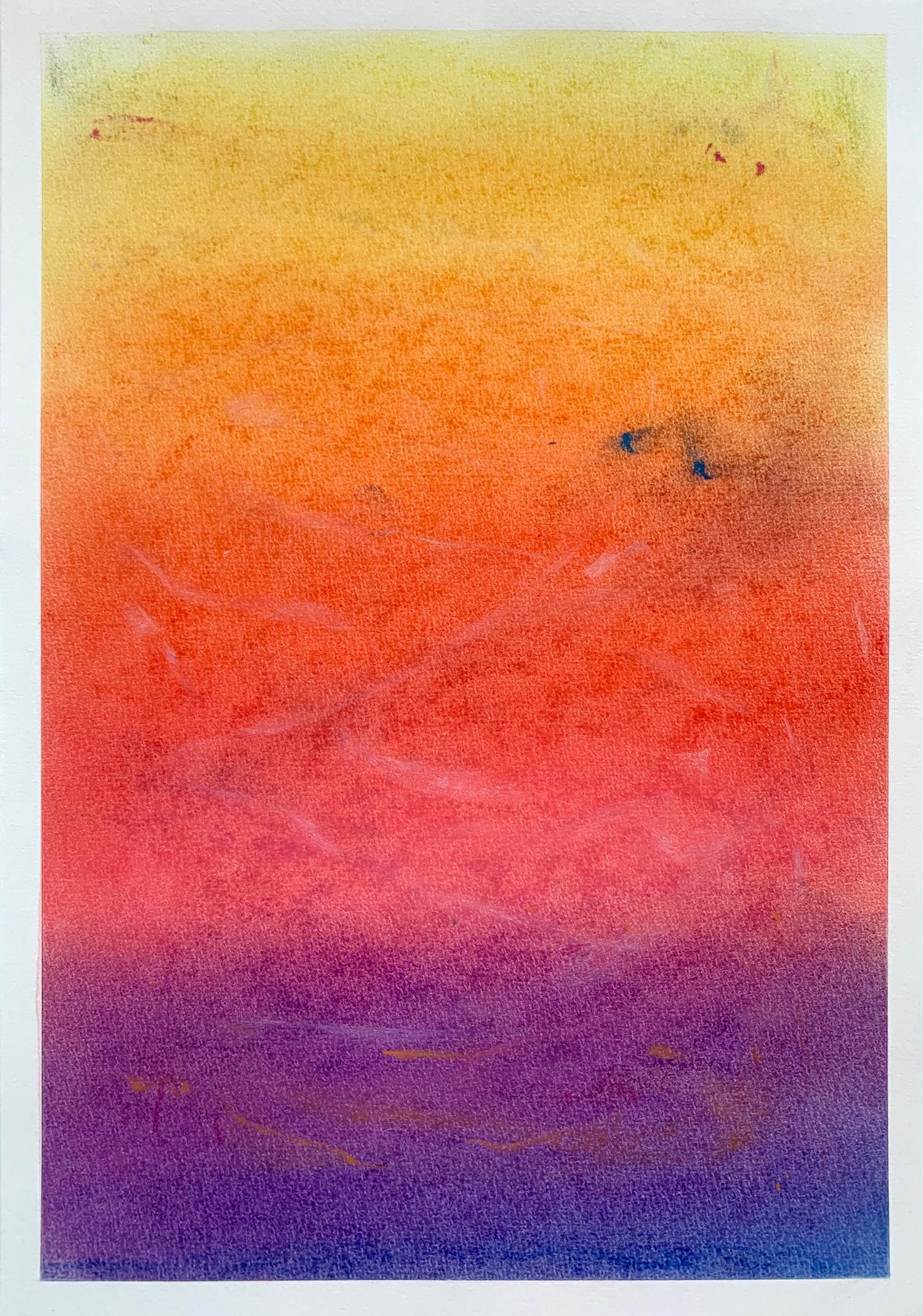
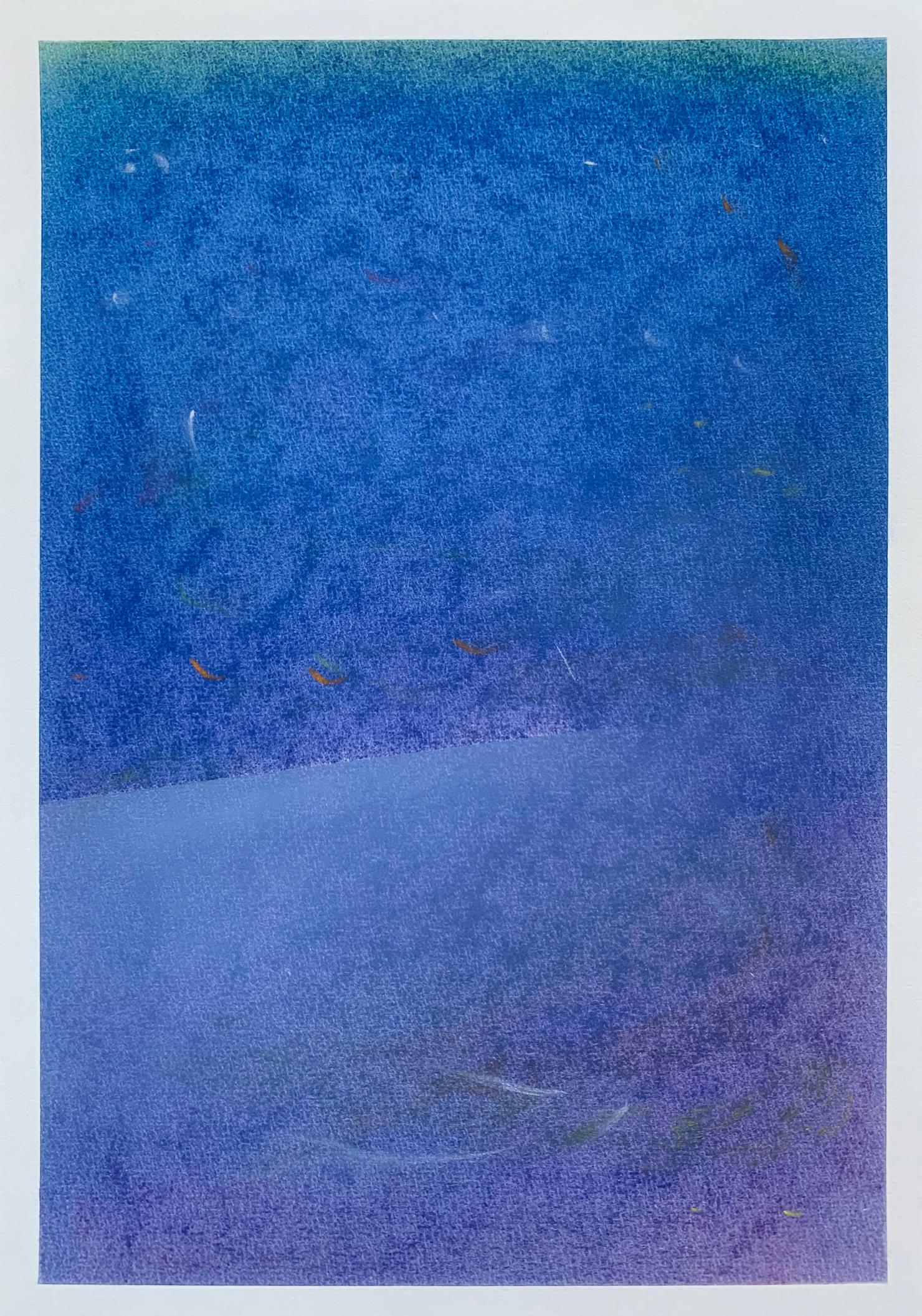
In Carsten Fock’s oeuvre, which has from the outset dealt with subjects such as Romantic and expressive landscape painting, these works on paper form a deep break. They dispense with affect-laden gestures, grandiose, bold settings, pictorial references and political or pop-cultural allusions that were otherwise associated with his landscape painting. Despite their luminosity, they are fine, velvety, covered with cloudy hatchings. They are decidedly vulnerable. Yet they remain dry, unexcited – nothing flows, no blood, no tears, no colour. Associations naturally abound to Romantic landscape painting and Caspar David Friedrich, to the maritimepaintings of Turner, the sacred colour spaces of Rothko and to visionary or religious art. The formats, the focus on process and material – all this, however, is the programme for a transcendent painting that entirely does without pathos. There is no emotional sublimity here, no conquest of the summit or the picture, no monk by the sea. Carsten Fock’s paintings are profoundly unheroic. They rather spring from a capitulation, an inner distress. They speak of a return to the essential, a refinement of perception, a sensitivity that is vital.
En la obra de Carsten Fock, que desde el principio ha tratado temas como la pintura de paisaje romántica y expresiva, estas obras sobre papel suponen una profunda ruptura. Prescinden de los gestos cargados de afecto, los decorados grandiosos y audaces, las referencias pictóricas y las alusiones políticas o pop-culturales que de otro modo se asociaban a su pintura de paisaje. A pesar de su luminosidad, son finas, aterciopeladas, cubiertas de eclosiones turbias. Son decididamente vulnerables. Sin embargo, permanecen secos, sin emoción: no fluye nada, ni sangre, ni lágrimas, ni color.Naturalmente, abundan las asociaciones con la pintura de paisaje romántica y con Caspar David Friedrich, con las pinturas marítimas de Turner, con los espacios de color sagrados de Rothko y con el arte visionario o religioso. Los formatos, la concentración en el proceso y el material, todo esto, sin embargo, es el programa de una pintura trascendente que prescinde por completo del patetismo. Aquí no hay sublimidad emocional, ni conquista de la cumbre o del cuadro, ni monje junto al mar. Los cuadros de Carsten Fock son profundamente poco heroicos. Surgen más bien de una capitulación, de una angustia interior. Hablan de un retorno a lo esencial, de un refinamiento de la percepción, de una sensibilidad vital.
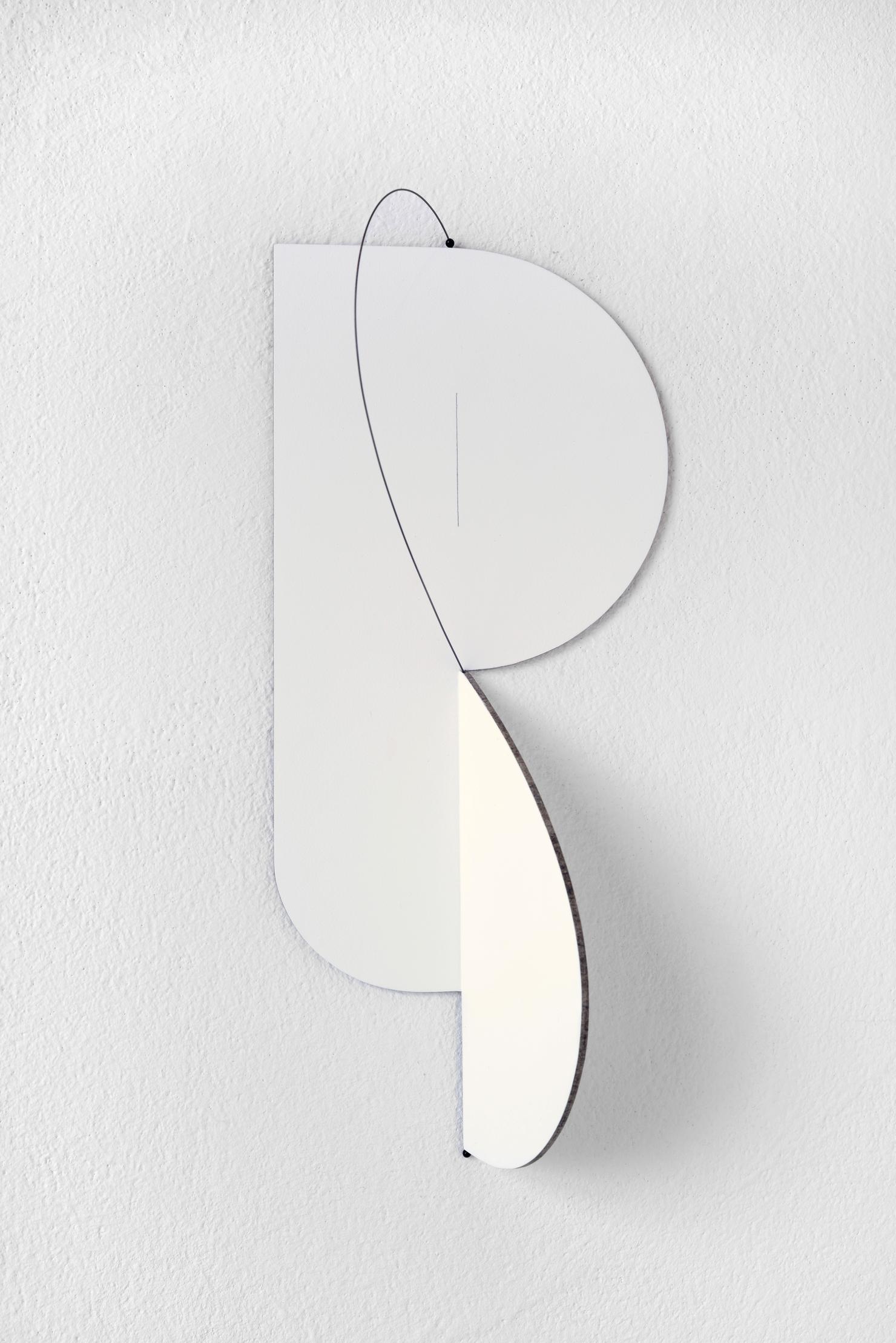
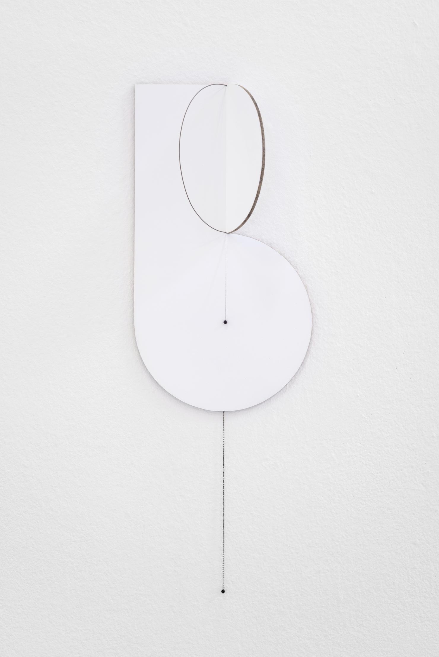
JONG OH
*1981
lives and works in Seoul, Korea and New York, US.
The Korean artist Jong Oh creates minimal sculptures that respond to the given spatial situation. Oh describes this process as follows: “Responding to a site’s nuanced configuration, I build spatial structures by suspending Plexiglas and painted strings in the air. These elements connect or intersect with one another, depending on the viewers’ perspectives. Viewers walk in and around these paradoxical boundaries constituted by three-dimensionality and flatness, completion and destruction. The viewers’ experience becomes a meditation on perception’s whim.”In these compositions, Oh makes use of a limited selection of materials: string, fishing line, Plexiglas, and wooden rods. The strings are sometimes painted on one side and are thus visible from one side only or almost entirely invisible. By constantly arranging these materials anew, Oh adds the suggestion of additional dimensions to the three-dimensional space. Lights and shadows extend these configurations by offering visual effects so that the highly fragile works resemble optical illusions of falling perspectives. In this dialogue of lines and planes, Oh is testing the limits of visibility. The works require an increased awareness of delicate oscillations and variations. Jong Oh is thus clearly making a case for an attention to small details, especially in the hectic bustle of everyday life. In a highly formal language that is almost completely free of narrative moments, Oh appeals above all to the viewers’ experience of the world. Alternating between sculpture and intervention, intangible image and installation, Oh considers each of his works as a carefully composed visual poem: “The works become subtle and restrained visual poems. Each only a few lines long, but addressing the universal.”
El artista coreano Jong Oh crea esculturas mínimas que responden a una situación espacial determinada. Oh describe este proceso de la siguiente manera: "En respuesta a la configuración matizada de un lugar, construyo estructuras espaciales suspendiendo en el aire plexiglás y cuerdas pintadas. Estos elementos se conectan o se cruzan entre sí, dependiendo de la perspectiva del espectador. Los espectadores caminan dentro y alrededor de estos límites paradójicos constituidos por la tridimensionalidad y la planitud, la compleción y la destrucción. La experiencia del espectador se convierte en una meditación sobre el capricho de la percepción".En estas composiciones, Oh utiliza una selección limitada de materiales: cuerda, hilo de pescar, plexiglás y varillas de madera. A veces, las cuerdas están pintadas por una cara, por lo que son visibles desde un solo lado o casi totalmente invisibles. Al disponer estos materiales de nuevo constantemente, Oh añade la sugerencia de dimensiones adicionales al espacio tridimensional. Las luces y las sombras amplían estas configuraciones ofreciendo efectos visuales, de modo que las obras, muy frágiles, parecen ilusiones ópticas de perspectivas que caen. En este diálogo de líneas y planos, Oh pone a prueba los límites de la visibilidad. Las obras requieren una mayor conciencia de las delicadas oscilaciones y variaciones. De este modo, Jong Oh aboga claramente por prestar atención a los pequeños detalles, especialmente en el ajetreo de la vida cotidiana. Con un lenguaje muy formal y casi exento de momentos narrativos, Oh apela sobre todo a la experiencia del mundo que tiene el espectador. Alternando entre escultura e intervención, imagen intangible e instalación, Oh considera cada una de sus obras como un poema visual cuidadosamente compuesto: "Las obras se convierten en poemas visuales sutiles y comedidos. Cada una de ellas sólo tiene unas líneas, pero se dirigen a lo universal".
BARBARA PROSCHAK
* 1984
Lives and works in Leipzig
2017 - 20: Master student with Prof. Tina Bara, HGB Leipzig
2012 - 15: Studies at the HGB with Prof. Tina Bara, artistic photography
2007 - 11: Studies at the FH Gestaltung Bielefeld, Department of Photography and Media with Suse Wiegand
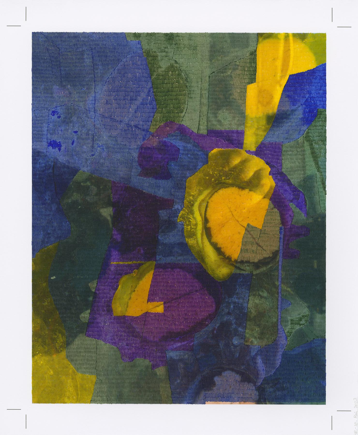
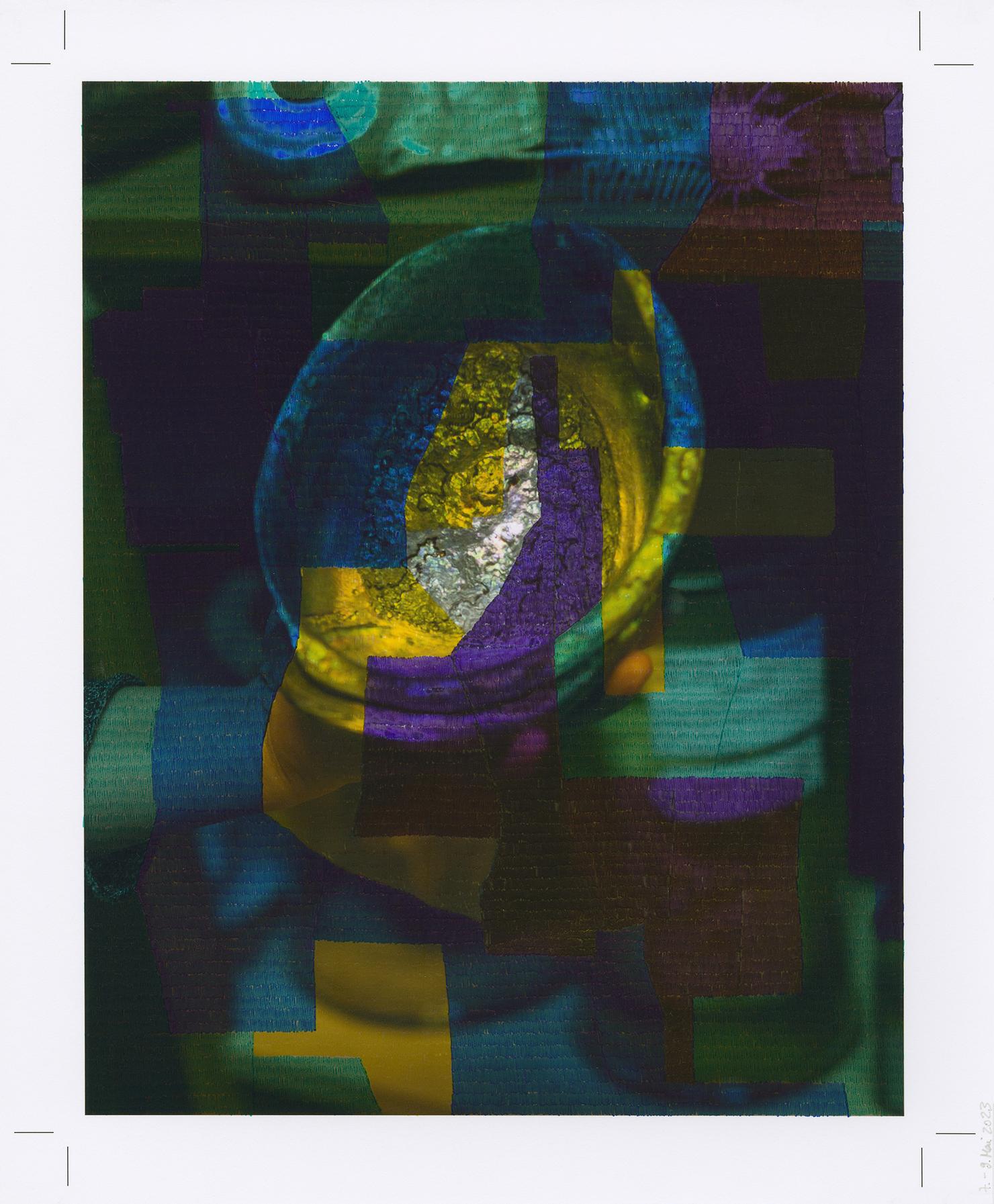
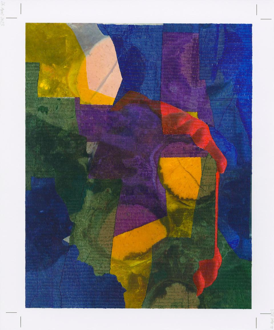
Her artistic practice revolves around collecting objects in images and placing the individual images in relation to one another. The picture panels created in these compilations are reminiscent of display panels from a museum and pretend to be objective, although they often have an inherent playful, associative lightness. The objects that are placed in a new context in this way are on the one hand objects that could come from natural history collections, such as prepared butterflies or magnolia blossoms, and on the other hand objects from the consumer world, such as a Korean bodyshaping suit or a red designer chair, in or on which the photographer depicts herself and thus relates herself to the objects.
Putting one’s own body in relation to the environment and the objects to be examined is an elementary aspect of Barbara Proschak’s artistic practice. A physical confrontation with what she has found is also the subject of her current series of overdrawings, in which the artist overwrites printed photographs with small vertical lines, which, placed close together, produce strips of color, bars of color and finally areas of color. They are transformations of photographs achieved through painterly intervention.
In her works, Proschak creates a new, art-immanent reality – on her picture panels by creating unexpected connections between individual images and her overdrawings, in which she transforms the factuality of the world into a pictorial space for searching and experiencing. Her works are interventions in the known and familiar, questioning the expected. It is always about the search for new forms, for new possibilities of perception, interpretation and the ongoing process. In Proschak’s works, the pictorial narrative always remains open. No facts are presented here, but new associations are playfully provoked.
Su práctica artística gira en torno a la recopilación de objetos en imágenes y la colocación de cada una de ellas en relación con las demás. Los paneles de imágenes creados en estas recopilaciones recuerdan a los paneles de exposición de un museo y pretenden ser objetivos, aunque a menudo tienen una ligereza lúdica y asociativa inherente. Los objetos que se sitúan de este modo en un nuevo contexto son, por un lado, objetos que podrían proceder de colecciones de historia natural, como mariposas preparadas o flores de magnolia, y, por otro, objetos del mundo del consumo, como un traje coreano para moldear el cuerpo o una silla roja de diseño, en los que la fotógrafa se representa a sí misma y así se relaciona con los objetos.
Poner el propio cuerpo en relación con el entorno y los objetos a examinar es un aspecto elemental de la práctica artística de Barbara Proschak. La confrontación física con lo encontrado es también el tema de su actual serie de sobredibujos, en la que la artista sobrescribe fotografías impresas con pequeñas líneas verticales que, colocadas muy juntas, producen franjas de color, barras de color y, por último, áreas de color. Son transformaciones de fotografías logradas mediante la intervención pictórica.
En sus obras, Proschak crea una realidad nueva, inmanente al arte, en sus paneles pictóricos mediante la creación de conexiones inesperadas entre imágenes individuales y sus sobredibujos, en los que transforma la facticidad del mundo en un espacio pictórico para la búsqueda y la experiencia. Sus obras son intervenciones en lo conocido y familiar, cuestionando lo esperado. Se trata siempre de la búsqueda de nuevas formas, de nuevas posibilidades de percepción, interpretación y proceso continuo. En las obras de Proschak, la narrativa pictórica siempre permanece abierta. No se presentan hechos, sino que se provocan juguetonamente nuevas asociaciones.
IMI KNOEBEL
* 1940 in Dessau
lives and works in Düsseldorf
1964 art academy Düsseldorf student of Joseph Beuys
Imi Knoebel is regarded as an outstanding representative of radical non-objective painting. From the very beginning, his aim was to break the boundaries of the genre and conquer space. He studied at the Düsseldorf Academy in Joseph Beuys' class and, together with Rainer Giese, fought for the legendary Room 19, which became a free space for artistic experimentation for both of them.Rejecting any representational function of art, Imi Knoebel's early work is characterized by reduced colours and a geometric vocabulary of forms. The path leads from black and white line paintings to spatial installations made of hard fiber images and bodies to colored paintings on wood and aluminum, always located between image and sculpture. Design principles such as layering, sequencing and stacking as well as a predominantly serial working method and the increasingly virtuoso use of color characterize his work to this day.
Imi Knoebel está considerado un destacado representante de la pintura radical no objetiva. Desde el principio, su objetivo fue romper los límites del género y conquistar el espacio. Estudió en la Academia de Düsseldorf en la clase de Joseph Beuys y, junto con Rainer Giese, luchó por la legendaria Sala 19, que se convirtió para ambos en un espacio libre de experimentación artística.Rechazando cualquier función representativa del arte, los primeros trabajos de Imi Knoebel se caracterizan por colores reducidos y un vocabulario geométrico de formas. El camino lleva de pinturas lineales en blanco y negro a instalaciones espaciales hechas de imágenes y cuerpos de fibra dura a pinturas coloreadas sobre madera y aluminio, siempre situadas entre la imagen y la escultura. Principios de diseño como la estratificación, la secuenciación y el apilamiento, así como un método de trabajo predominantemente en serie y el uso cada vez más virtuoso del color caracterizan su obra hasta hoy.
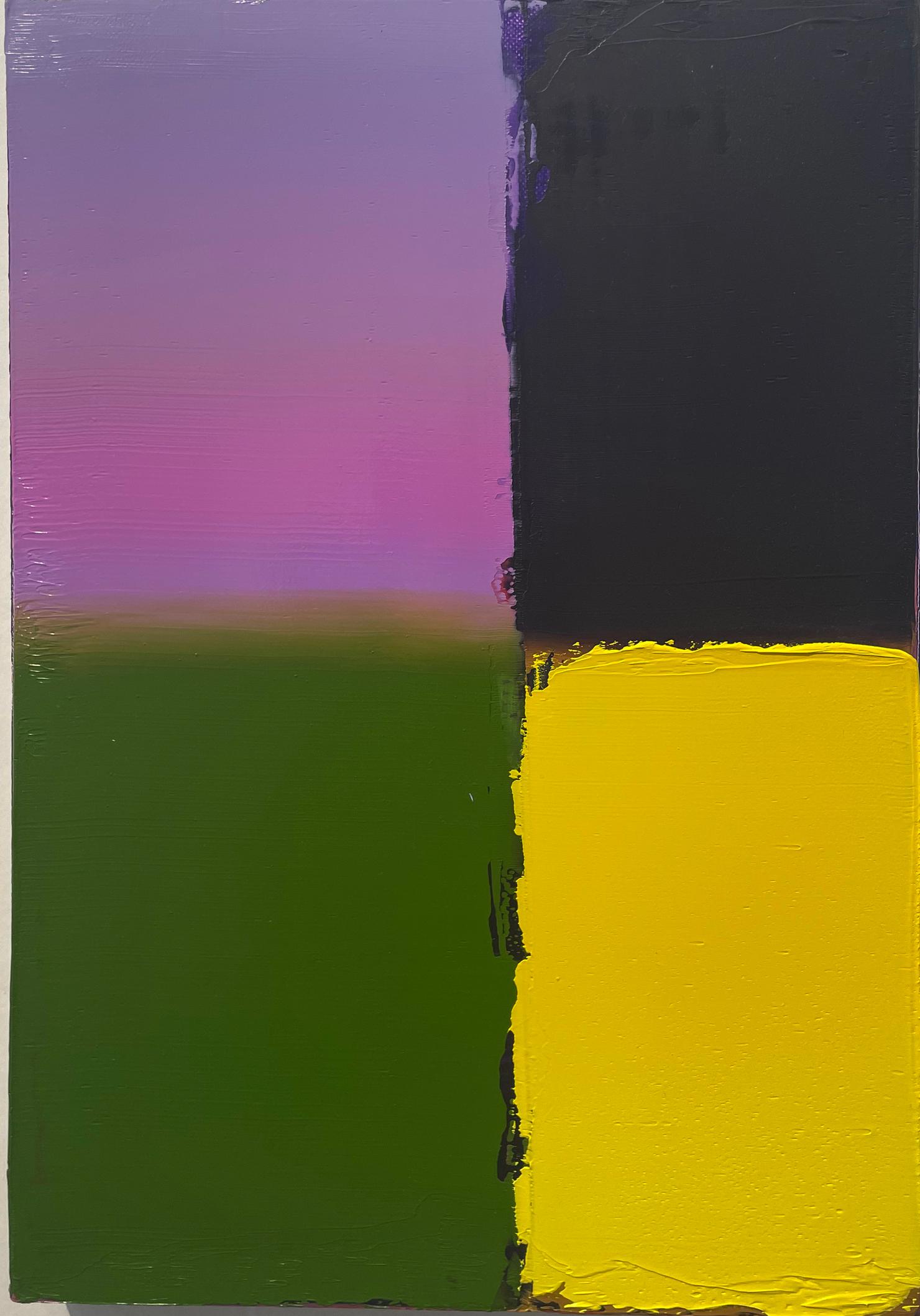
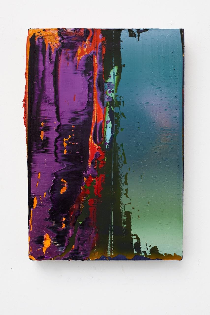
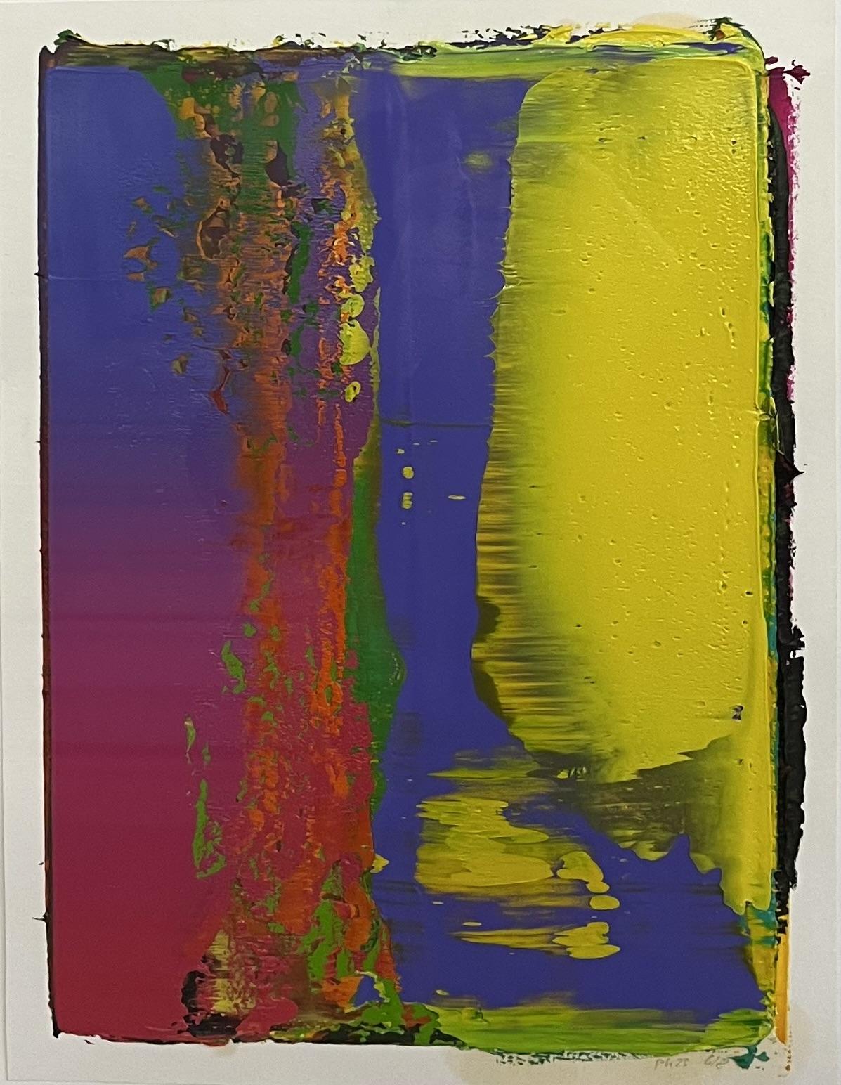
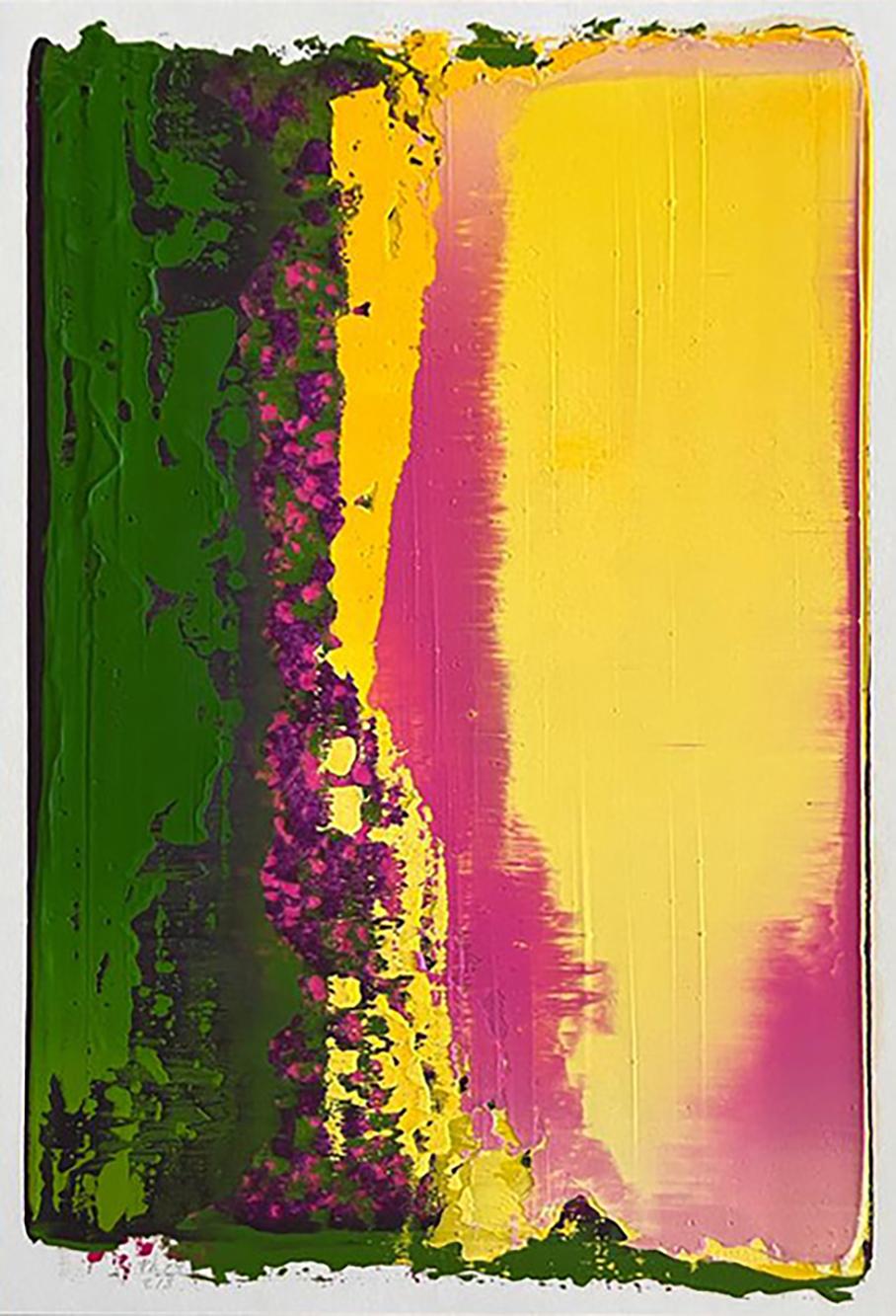
PETER KRAUSKOPF
* 1966 in Leipzig
lives and works in Berlin
1989-1995 study of painting - HGB Leipzig
1997 master student of Arno Rink
His works appear at first abstractly and distinctly from any figurative expression. Nevertheless, a concrete picture content is to be assumed, but in the process of painting a seemingly non-existent, subordinate role was assigned. This aspect lends the works of Krauskopf an immense depth. The opaque coloring and the resulting structures of the paintings make them come alive. With the help of various squeegees and wide brushes, impressive color sequences are manifested on the canvases. Thus the rationality ends where a painting by Peter Krauskopf begins. This makes it so easy for the recipient to persist in the artistic work.
A primera vista sus obras aparecen abstractas y distintas de cualquier expresión figurativa. Sin embargo, se debe asumir un contenido concreto para la imagen, aparentemente inexistente durante el proceso creativo.Este aspecto proporciona una inmensa profundidad en las obras de Krauskopf, cuyos tonos opacos y las estructuras resultantes parecen dotar de vida a las pinturas. Empleando diferentes espátulas y pinceles anchos, las impresionantes sucesiones de colores se manifiestan en los lienzos; la racionalidad termina donde empieza una pintura de Peter Krauskopf. Esta es la razón por la es tan fácil para el observador aferrarse a su trabajo artístico.
CAROLINA PÉREZ PALLARES
*1980 Quito, Ecuador
2004 - 2009 Studied painting/graphics at the State Academy of Fine Arts Karlsruhe
2010 Graduated as a master student in the Marijke van Warmerdam class
Carolina Pérez Pallares (*1980 Quito/Ecuador) works against the background of an expanded concept of painting. She is a graduate of the Staatliche Akademie der Bildenden Künste Karlsruhe and a master student of Prof. Marijke van Warmerdam. Her works have been exhibited internationally in solo exhibitions (MAC Museo de Arte Contemporáneo de Chile, CAC Museo de Arte Contemporáneo in Quito Ecuador, Kunstraum V8 Plattform in Karlsruhe, Cité Internationale des Arts in Paris, etc.) and in group exhibitions (Kunstraum V8 Plattform in Karlsruhe, Cité Internationale des Arts in Paris, etc.). ) as well as in group exhibitions (Kunsthalle Mannheim, Kunststiftung Erich Hauser, Galerie der Stadt Sindelfingen, PIFO Gallery in Beijing, Kunsthalle Schwäbisch Hall, Centro de Arte Contemporáneo in Quito Ecuador, Neue Galerie im Höhmannhaus der Museen Augsburg, Kunsthalle Mulhouse, MAC Museo de Arte Contemporáneo de Chile, Forum Würth in Arlesheim, Kunsthalle Basel, etc.).In her artistic practice, Carolina Pérez Pallares constantly re-examines both the general and her personal concept of painting. The painting is freed from the canvas and understood as a culturally shaped process that is made up of a wide variety of components. In the exhibition "Die Farbe teilt ihre ungerechte Haltung", these components are illuminated in five works. The material, e.g. the painting support, binders and pigments, are examined in the same way as aspects of production, e.g. artistic traces or the artist's role and self-image, or aspects of reception such as the social understanding of painting and the relationship between painting and other disciplines of the visual arts. Carolina Pérez Pallares uses a consistently clear formal language to reflect and sensitively present the contemporary concept of painting.
Carolina Pérez Pallares (*1980 Quito/Ecuador) trabaja sobre el trasfondo de un concepto ampliado de la pintura. Es licenciada por la Staatliche Akademie der Bildenden Künste Karlsruhe y alumna de máster de la profesora Marijke van Warmerdam. Sus obras se han expuesto internacionalmente en exposiciones individuales (MAC Museo de Arte Contemporáneo de Chile, CAC Museo de Arte Contemporáneo de Quito Ecuador, Kunstraum V8 Plattform de Karlsruhe, Cité Internationale des Arts de París, etc.) y colectivas (Kunstraum V8 Plattform de Karlsruhe, Cité Internationale des Arts de París, etc.). ), así como en exposiciones colectivas (Kunsthalle Mannheim, Kunststiftung Erich Hauser, Galerie der Stadt Sindelfingen, PIFO Gallery de Pekín, Kunsthalle Schwäbisch Hall, Centro de Arte Contemporáneo de Quito Ecuador, Neue Galerie im Höhmannhaus der Museen Augsburg, Kunsthalle Mulhouse, MAC Museo de Arte Contemporáneo de Chile, Forum Würth de Arlesheim, Kunsthalle Basel, etc.).En su práctica artística, Carolina Pérez Pallares reexamina constantemente tanto el concepto general como el personal de la pintura. La pintura se libera del lienzo y se entiende como un proceso culturalmente configurado que está formado por una gran variedad de componentes. En la exposición "Die Farbe teilt ihre ungerechte Haltung", estos componentes se iluminan en cinco obras. El material, por ejemplo el soporte pictórico, los aglutinantes y los pigmentos, se examina del mismo modo que aspectos de la producción, por ejemplo las huellas artísticas o el papel y la autoimagen del artista, o aspectos de la recepción como la comprensión social de la pintura y la relación entre la pintura y otras disciplinas de las artes visuales. Carolina Pérez Pallares utiliza un lenguaje formal consistentemente claro para reflejar y presentar con sensibilidad el concepto contemporáneo de la pintura.
BERIT SCHNEIDEREIT
*1988 in Frankfurt am Main, Germany
lives and works in Düsseldorf, Germany
Kunstakademie Düsseldorf
Prof. Andreas Gursky / Prof. Hubert Kiecol
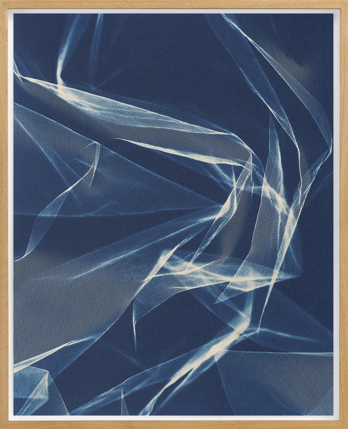
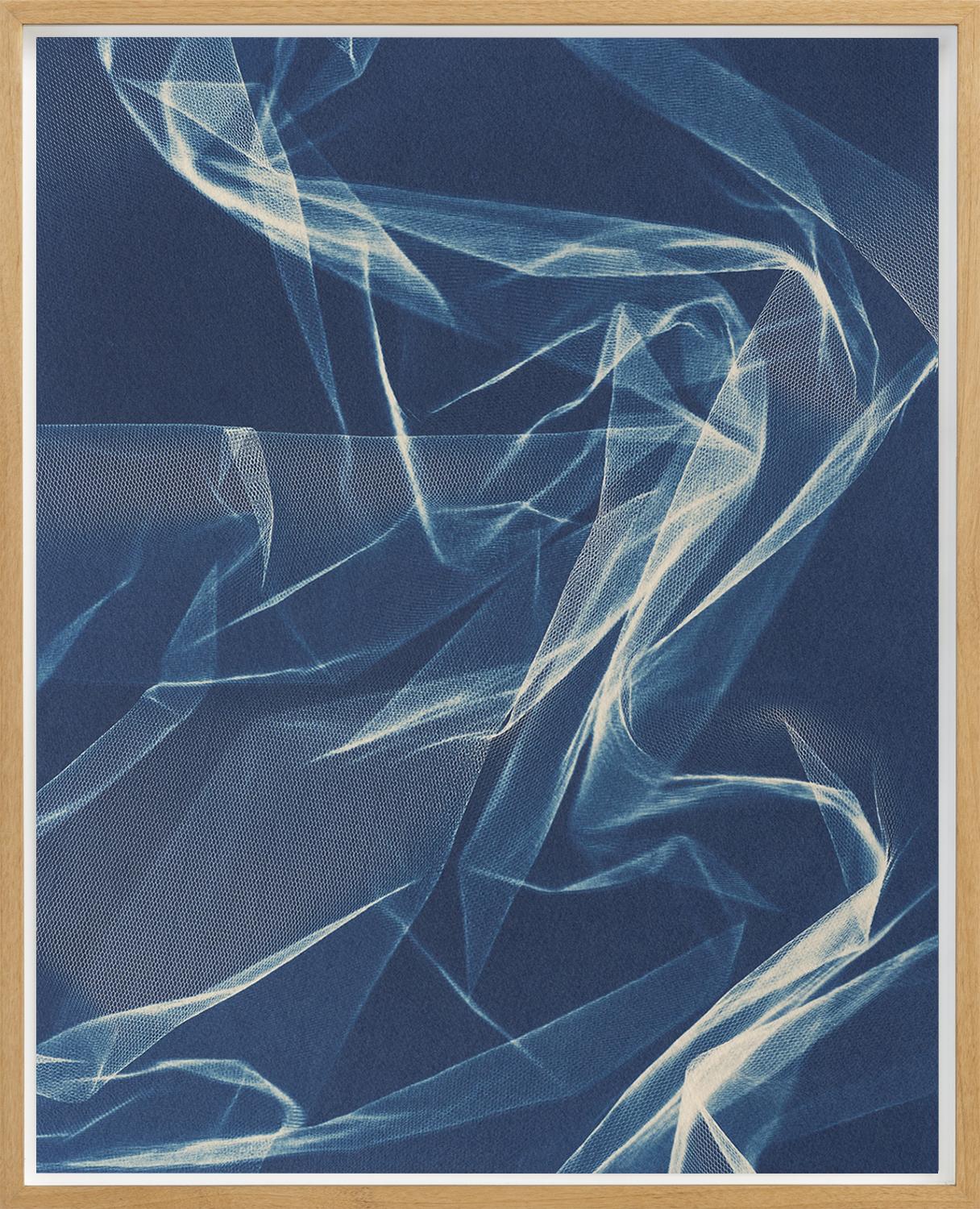
Berit Schneidereit (*1988) understands photography from the visual aspect to the plastic pictorial reality, whereby she always negotiates access to the three-dimensional in disposition to the pictorial surface by including materiality and spatial sequence.
Via structural honeycomb patterns and monochrome uniformity, her photographic works lead to a visual scanning of the spatial, in which the artist combines techniques of the photographic such as the photogram, analogue and digital image production in black and white and colour on an equal footing. Schneidereit's images suggest a movement through photographic spaces like those of William Henry Fox Talbot, Erika Kiffl or Andreas Gursky, but in this coherence they formulate their own narrative between image surface, image body and image space, combining the sensual with her conceptual interest in photography.
Berit Schneidereit (*1988) entiende la fotografía desde el aspecto visual hasta la realidad pictórica plástica, por lo que siempre negocia el acceso a lo tridimensional en disposición a la superficie pictórica mediante la inclusión de la materialidad y la secuencia espacial.
Mediante patrones estructurales en forma de panal y uniformidad monocroma, sus obras fotográficas conducen a una exploración visual de lo espacial, en la que la artista combina técnicas de lo fotográfico como el fotograma, la producción de imágenes analógicas y digitales en blanco y negro y en color en pie de igualdad. Las imágenes de Schneidereit sugieren un movimiento a través de espacios fotográficos como los de William Henry Fox Talbot, Erika Kiffl o Andreas Gursky, pero en esta coherencia formulan su propia narrativa entre la superficie de la imagen, el cuerpo de la imagen y el espacio de la imagen, combinando lo sensual con su interés conceptual por la fotografía.
further information www.jochenhempel.com
@jochenhempel
Ch.ACO 2024
OPENING TIMES:
Jueves 21 al Domingo 24 de Marzo 2024, 12:00 hrs
LOCATION:
Avenida Alameda Libertador Bernardo O'Higgins 227, Santiago, Chile
LINK: